District unveils shining new look
October 2, 2019
A new district logo unveiled last month is updating the district’s look.
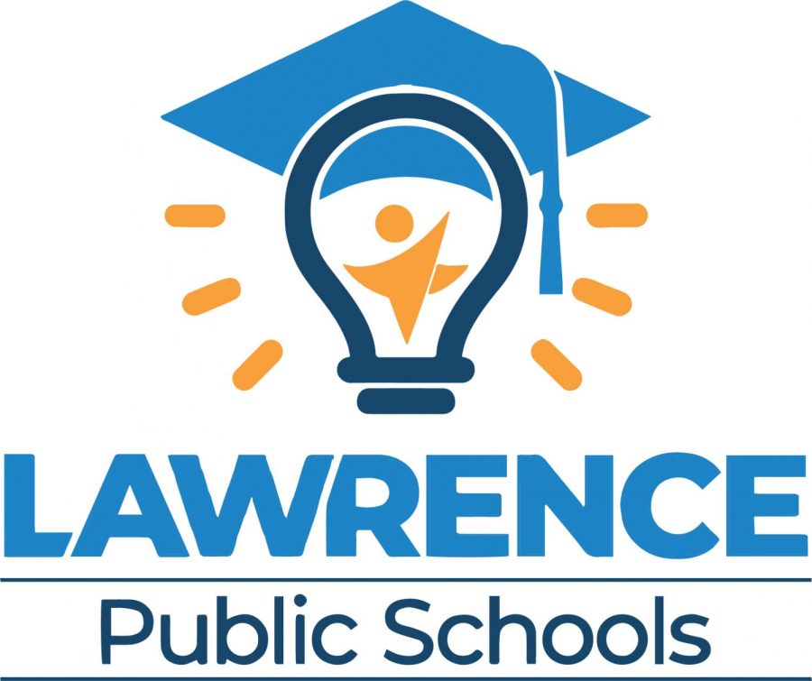
This new logo features a star as its centerpiece, with one of the star’s points replaced with a dot so it looks like a student. The student is the filament of a light bulb, which is wearing a mortarboard.
“The image represents that at the heart of our district are students, who are bright, creative, and full of ideas of how they will change the world,” said Julie Boyle, executive director of communications for USD 497. “It represents the ‘aha’ moments students have when their teachers help them gain knowledge and learn new skills in the classroom.”
Boyle said the mortarboard — or graduation cap — represents the district’s mission of “ensuring educational equity and excellence so that students of all races and backgrounds achieve at high levels and graduate prepared for success in college, careers, and life in a diverse and rapidly changing world.”
The new logo will be phased in gradually, Boyle said.
Some LHS students had a hand in reviewing it during the summer. There were six different designs presented, and elements like fonts and colors were interchangeable. Junior Riley Unekis, who had input on the logo, was not completely satisfied.
“Before inside of the light bulb there was a little filament person, but now there’s an actual star jumping person,” she said. “It’s interesting.”
This change comes about simultaneously with the beginning of the district’s five-year strategic plan.


